Websites for Texas realtors
A link page, a buyer quiz that does your first meeting, and a review page clients actually use. Built for the phone in your buyer's hand.
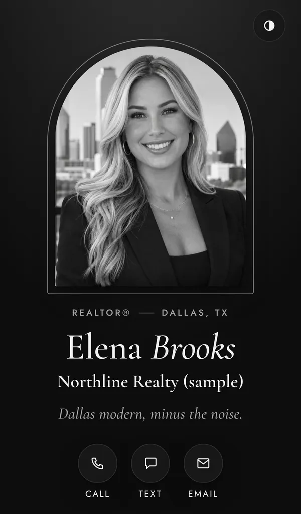
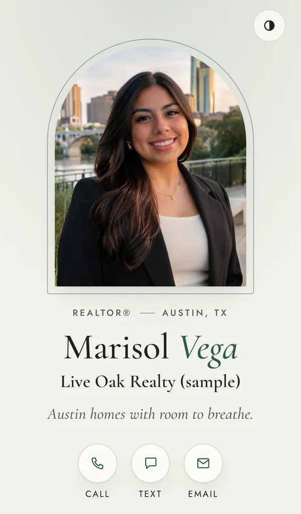
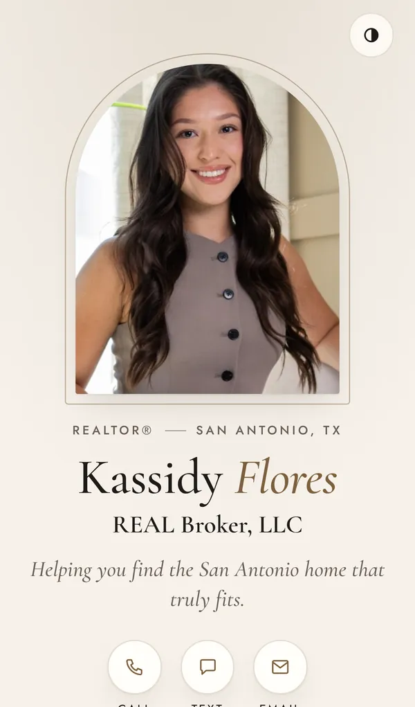
The idea
Buyers decide in seconds whether you're their agent. Your site should feel like walking into a home that's already theirs: warm, effortless, and one tap from calling you.
The work 06
One client live. Five ways yours could look.
Swipe or drag the wall. Tap a site to step inside.
01 / 06
What you get
Everything a buyer needs, in one link.
-
01
Your link page
Your photo, brokerage and every button you hand out. "Save my contact" puts you in a buyer's phone, photo included, in one tap. Both TREC notices sit in the footer, linked.

-
02
A buyer quiz that does the first meeting
About three minutes, no login. Price, beds, area, then picture cards: what they love, what they can live with, what's a hard no.

-
03
Leads that arrive ready to search
Every answer lands in your email with a search you can paste into the MLS. You walk into the first call already knowing what to send.

-
04
Reviews in a minute
Your client writes it once. Each button copies it and opens Zillow or Google, so they just paste. Fewer "I'll do it later" that never happen.

- Your domainYour name in the address bar, not a template's.
- Your lookYour colors, your photo, your type. Light and dark mode.
- On their home screenClients can add it like an app, so you're one tap away.
- Leads to youQuiz answers go straight to your inbox. No middleman.